Slack Clone (Vue.js + Django) Part 1: A simple Slack chat interface using Tailwind CSS
Welcome to a new series I will be writing — making a Slack clone using Vue.js + Django Rest Framework. If you are unfamiliar with either of these, I would highly recommend getting a basic understanding before going through this series, because I will be assuming some basic knowledge on your part. There is a lot of wonderful beginner content for these frameworks like Vue School, this guide by “simpleisbetterthancomplex”, and so on. I don’t want to just repeat what has already been said.
In this first part, I want to walk through creating a nice, simple interface for messaging in a particular Slack conversation. We will not add any features yet, like actually sending messages, switching channels, or logging in, but this is just a basic foundation for future parts of the series. The focus will be on how to use Tailwind CSS to create a clean interface.
All source code is linked below!

Vue.js Project Setup
I’m not going to cover in depth the setup process, for reasons aforementioned. Here is a general overview.
- Initial Setup: use Vue CLI to create a new project. Some notable configurations I have: ✔️ Vue Router, Vuex, Babel, TypeScript, ESLint + Airbnb configuration ✔️, ❌ no CSS pre-processor ❌(this is important because it can mess with Tailwind CSS).
- Add Tailwind CSS: This is very simple if you use the Vue CLI, just use this command:
vue add tailwind(credits). - Other packages: I like to use an HTML preprocessor called “pug” (
npm install -D pug pug-plain-loader). Also, I will use an icon pack called “vue-feather-icons” (npm install vue-feather-icons @types/vue-feather-icons). - ESLint Rules: Some ESLint rules that drive me crazy so I turn them off.
{
  'max-len': 'off',
  'lines-between-class-members': 'off',
  'indent': 'off',
  'comma-dangle': 'off'
}
Building the Interface
We’ll start with a full-width/full-height div to house all the sub-components. We want to use overflow-hidden so that we can let certain child components, such as the one housing the messages, to be able to scroll independently, without the entire page scrolling.
Now, let’s start with the sidebar. First, we’ll make a simple div with a background color and good width to be our sidebar. We of course want it to be full height. We also add the small section with our workspace name in it.

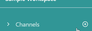
Then, we will add our “Channels” and “Direct Messages” sections. First, let’s make the header for a section, starting with “Channels.”
We will use a flex div to with justify-between to separate the icon and text “> Channels” from the plus icon on the right. This is a common technique to separate two elements in a flex-box at the leftmost and rightmost, since justify-between will put as much space evenly “between” each element as possible.
This section header is also clickable, and the click handler toggleChannelDropdown simply toggles a Boolean data variable called showChannels . As you can see, we display the “right” vs. “down” icon according to whether the dropdown is being shown or not.
Then, we’ll make the actual body of the dropdown, which is the list of channels. We’ll start with a div that is conditionally rendered on showChannels . Then we’ll have a div wrapping two span elements, one for the pound sign and the other for the channel name. I am using a v-for to repeat the element 10 times just for visual purposes, but obviously later on we will replace that.
Now, I am going to basically copy and paste all that to make a new section for “Direct Messages.” Also, as with any time you’re copying & pasting code, you should be thinking about “is there a way to abstract this?” The answer here is: yes, but later 😉 — strategic procrastination. So here we end up with the following:
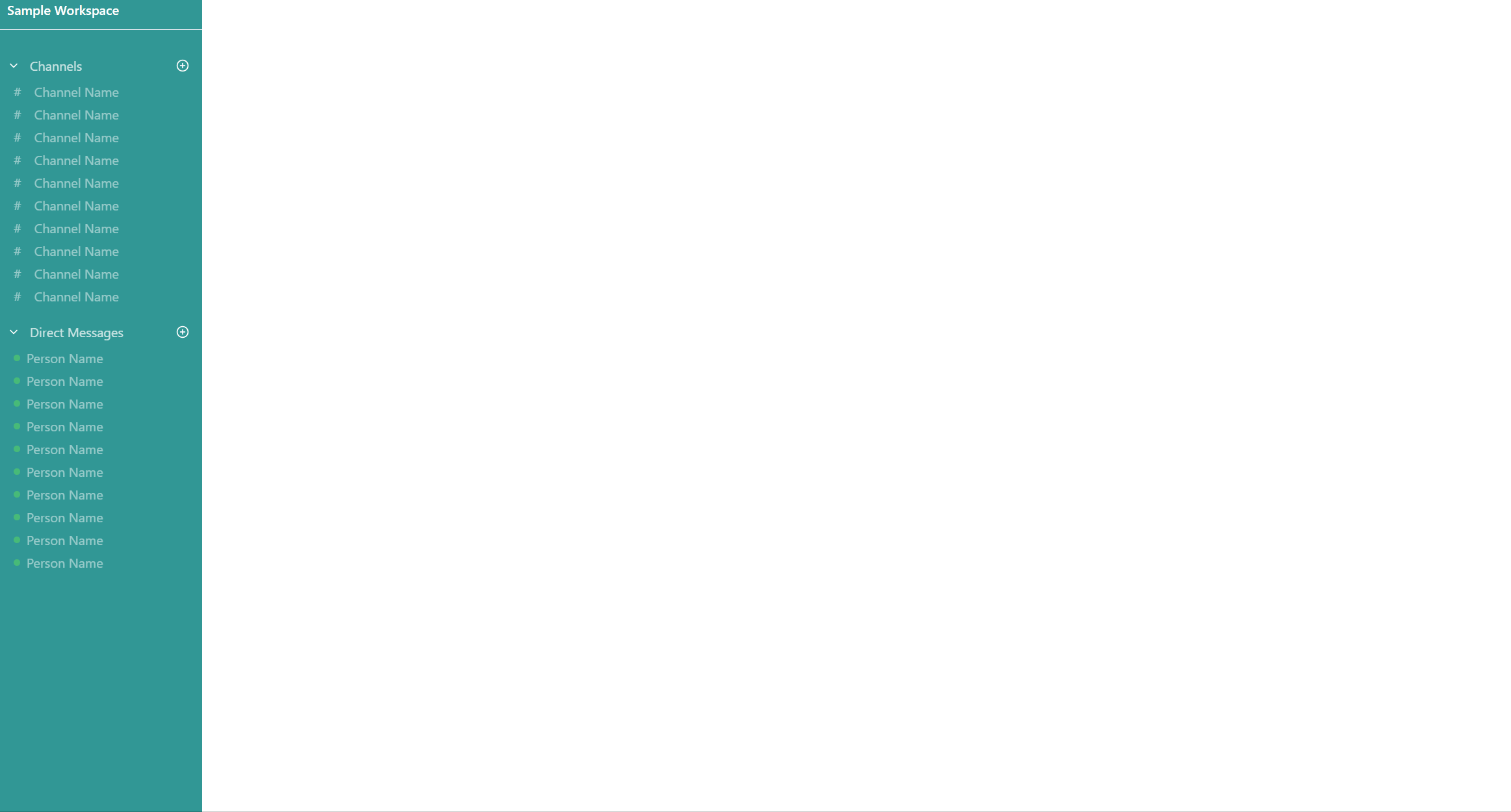
Now, let’s move over to the right towards the messages. First, we’ll create a parent div for all the stuff on the right. The outer div is overflow-hidden, again, so that the inner div can actually scroll without scrolling the outer div. Other than that, we want it to be flex-col , because the conversation header, messages, and message send box will all be aligned vertically.
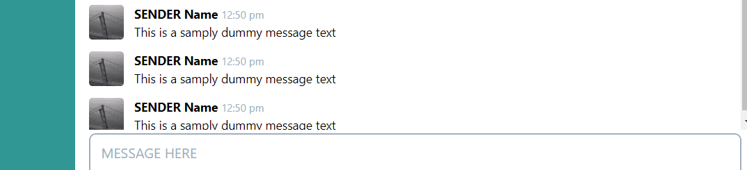
Now, let’s add some messages. We’ll use a flex box to arrange the photos next to the text, and an inner flex box to arrange the two rows of text (name + timestamp & the message body). The image is set to a square width/height, and the image source is from Picsum photos. Again, v-for is used so we can see the scroll in action.
Then, we’ll form the conversation header and the box to send a message.
Altogether, it looks like so:
Finally, the last part we want to add is a set of action buttons when hovering a specific message.
First, we need to modify the code for a single message. I have extracted it into a separate component so that we can keep track of whether each message is being hovered within its own component data. Notably, I added mouseover and mouseleave listeners that will toggle a boolean isHovered . Based on this, we will make the background gray and show the “actions” for this specific message. Also, we need to add the relative class to the root div, which will enable us to use absolute positioning for the “actions.”
The code for the actions is below. The @apply command is a Tailwind CSS feature, which just applies the CSS from a class within another CSS class. Notice that we use absolute positioning for the outer div for the action buttons. The top: -16px; right: 27px are indicating the position of this div relative to the top/right of the outer message div that has relative positioning.
With all that, we should now have a solid interface to work off of. In future parts, we will make the interface more interactive, as well as adding a backend to make our app fully-featured! Again, here is the GitHub link for all the source code: https://github.com/chang-andrew/slack-clone-tutorial
Thanks for reading and happy coding :)


![Better Vue Components with TypeScript [12 examples]](https://miro.medium.com/v2/resize:fit:679/1*jhRY42JUYkkvpQp3gBBtdw.png)
